| |


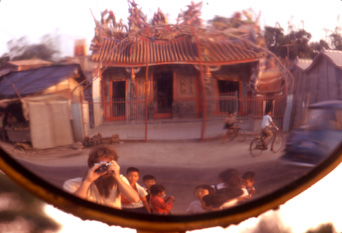
Self-portrait of me at work in Taiwan in 1972. Unlike China, as Taiwan became more prosperous, the number of temples increased.
|
|
|


The images in this book were primarily taken during the 1970s. Some were taken in the mid 1980s and late 1990s.
The photographs are sequenced following a general west-to-east direction of travel. The first images are from Iran and last are from Japan. The following countries are represented: Iran, Afghanistan, Pakistan, India, Nepal, Sri Lanka, Bangladesh, Burma, Thailand, Indonesia, Philippines, Taiwan, China, [Tibet], Korea, and Japan. However, contrary to the order in the book, my own travels progressed in the reverse direction, starting in East Asia and ending up in Iran.
While the order is roughly west to east, country by country, the book's sequence occasionally departs from that constraint. Since I would often dash back and forth across borders to follow the weather or to game the visa requirements, sometimes the images in the book will jump from one country set to another, not to follow my travels but to fit into a visual rhythm. In general, though, they continue to drift eastwards - which has been the general drift of my heart.
My method of shooting was simple: smile, shoot first, ask questions later. It seemed to work. I spent enormous amounts of time hanging around places waiting for something to happen. Sometimes it did, often it didn't. Further years were spent in the back of local buses waiting to leave. I learned a lot, but the truth is, a lot of what I photographed I have only a vague notion of what was really going on. Asia is complex, infinitely deep, and I was just a kid with a camera. I slept in local inns; I ate whatever was being served, and yes, I drank the water anywhere the natives did. I got sick only once, in Katmandu - hepatitis A.
I used multiple 35mm cameras. I always carried two cameras, and I used different brands and types. The majority of the images were shot using a pair of mid-1970 Nikkormat camera bodies (one loaded with slow film, one with fast) and five very heavy old-fashioned lenses. I didn't carry a tripod. I had a tiny, weak and miserable flash unit that I rarely used. Almost every image in this book is shot with available light. I also used an early Pentax SLR. A number of photos were taken with an Olympus point and shoot camera. A few with a Minolta point and shoot. A bunch were taken with a fancier Canon EOS with zoom lens. Personally I can't tell the difference in image quality between cameras. The main difference showed up in certain low-light situations where an old fashion fixed and fast lens is much easier to keep steady.
The type of film in the camera made more of a difference. The bulk of the images were shot on slide film. The majority of them were Kodrachrome 64. These slides held up remarkably well. After 30 years of haphazard storage in garages, basements, closets, etc. they still retain their colors, which were pretty true to begin with. The remainder of the slides were shot on Ektachrome 200. These had that bluish cast to begin with and I noticed a further slight shift towards the blue over time too. But this cast was pretty easy to compensate for in Photoshop. I shot color print film (Kodacolor and Kirkland cheapo film) in the point and shoots. The main difference I noticed was that when the negatives were scanned they revealed far more grain than the slides. So these images don't look quite as smooth. But most people don't even notice.
I traveled solo most of the time I was shooting. I had lots of time and no money. I generally spent at least 2 months in a country; some like India and Taiwan I visited many times. I would be gone for years at a stretch. I would leave the US with 500 rolls of film in my backpack, all still wrapped in plastic "bricks. " I kept them in their packaging because it was more compact, but this also made the new film immensely resalable - and taxable - in these areas. Yet in all my years of travel in these drug ridden, smuggling countries, my backpack was never inspected upon leaving, or 600 image
any country, including upon return to the US!
As I shot film I would mail it back to my parent's home in Westfield, New Jersey. I'd find a cardboard box, tie it up, and mail it overseas at the cheapest back parcel post rate. It could take months for the package to get there, but I'm prettysure I did not loose a single roll of film. Since I had no money, my mom stuck all the film in her freezer. Later when I returned home, I'd find a job and begin paying to have the film developed. This meant that I would often not see what I shot until more than a year later. That could be disaster if a camera malfunctioned since I was shooting film every day. So about once a month I would splurge and have a roll developed locally to check my cameras.
Altogether I shot about 40,000 images. Merely examining these 40,000 images the first time took an entire summer. After several editing passes, I selected about 600 images for this book. That works out to one final image selected per two (36 exposure) rolls of film I shot. Professional photojournalists tell me that is a pretty good rate.
I investigated several different options to have the slides and negatives scanned. The official way to make an art book is to have each image drum-scanned at a cost of $20-40 a piece, and then to have them color corrected by a pro for additional fees. It would not be unheard of to spend $20,000 for scanning the amount of images in this book. Therefore I looked into home scanners by Nikon and Polaroid. These could have done a pretty good job, but the prospect of spending weeks scanning 600 shots didn't appeal to me. In the end I went with a consumer scan called the Kodak Photo CD. For about $1.20 a piece, I had my slides and negs scanned at a local service bureau specializing in digital scanning. They were returned digitized on a CD. The resolution of these scans are right at the edge of what is needed for a book this size. (For those who care, the typical file size for an image in this book is 20 megabytes.) Kodak Photo CDs were made for the consumer market as a way of getting images up on the web for granny to see. If professionals ever used it, it was for doing rough mock ups of a layout. But I felt the quality of this mockup tool was acceptable to my eyes and so I planned to use the cheap scans for the printing itself.
I then spent the next summer designing, laying out, and color correcting the book. The modular design of the book was laid out in the standard book-making software Quark Xpress. I used rough low-res versions of the images cached on a large hard disk to move around the sequence. The book was divided up into 20 page sections and I checked the layouts by printing out on an ordinary home Epson printer. Most of the production time for this book was spent in color correcting and touching up each image.
Photoshop is an astounding tool. Without too much training (thank you Charles Platt, Paul Donald, and Stephanie Johnson!) I learned to direct some of Photoshop's immense power toward restoring the images in my collection to a pristine state. I prefer to crop the image in the camera, so there was little cropping needed. I spent more of my days cloning out dust and mold specks, of which there were many. I spent a lot of time tweaking the color balance to better represent what I remembered of the scene. I would occasionally do a little manipulation (I removed some telephone lines I had wanted to remove at the time but couldn't), but I wasn't very good at it, so that prevented me from doing more. In fact I would have done a lot more manipulation of the images in Photoshop but I just didn't have enough time with 600 images. For the most part, these photographs were shot, the film scanned, color balanced by a dedicated amateur, and then printed. However, subtle as the color balancing was, it is immensely important in the overall look of the book, and I would not do a book without having that control. I'm told it also saved many tens of thousands of dollars in fees, too.
I proofed the book on an Epson Stylus 3000 ink jet printer. This is a 17x19-inch unit that allowed me to print out each spread (double pages) of the book on one sheet of paper. The ink jet images were simply gorgeous. Before starting on the process I had my monitor and ink jet printer calibrated together to ensure as exact a match between what I saw on the screen, and what came out of the printer. A friend, Warren Baskin, used a ColorVision spider on my monitor, and produced a printing profile for my Epson. I was surprised how close I could get the ink jet to match the colors of my Mitsubishi Diamond Pro monitor.
To close the loop, I had a set of test images converted into Kodak Color Approvals. These are expensive (about $100 apiece) proofs that match the output of an offset printing process. They show you what your images will look like when they are printed with press inks on coated paper. These Kodak Approvals matched the ink jet proofs close enough that I decided it wasn't necessary to make Kodaks for the rest of the book. So the Epson ink jet proofs became the proofs for the book, saving many more tens of thousands of dollars.
I sent the Taschen production office a stack of 24 CDs burned from my Mac that contained the digital files for the book. They inspected these, pulled some test prints of their own, and then sent the files to a digital plate maker.
The book was printed in Verona, Italy by EBS Printers, a family owned printing company that specialized in art books. They are located in an industrial fringe of that wonderful Roman city, in an area that has a long history of printing. I had the privilege of being on a "press check" during the run of the book.
The press was a sheet-fed German press, printing four colors. Each sheet took 20 pages each side, or 40 pages per sheet. They were stacked knee-high on palates. As the first of each sheet came off the press, the pressman would tweak controls on their behemoth and fine tune the color, adjusting the mix for different parts of a page. They expected (and planned) to "waste" 300 copies of each page to get the colors just right. The 30,000 copies of each sheet took, in total, about one week of 20-hour days to print. It was bound at a different factory in Italy and shipped over the world.
This book took thirty years to make; I began shooting around 1972. But it was not until recently that the technology of scanning, and pre-press, and layout was sufficiently off-the-shelf and accessible to non-professionals that I felt I could make the book that I had always seen in my imagination. I am very happy to say that with Taschen's support, this book is the book I have always longed to make. I wanted to be able to show my friends and strangers the same fabulously amazing and lively Asia I saw all those years, and I believe this book does that.
The images here are naturally low-res and small. We put them up as a guide to forthcoming text for each image - text that is not in the book so as to not distract the viewer from the spectacle of Asia. I urge you to seek out a bound copy of the printed book, which contains 320 pages of glorious color printed in the best high-res, four color, sheet-fed press available. It's going to be a long time before computer screens will equal this quality. Enjoy.
|

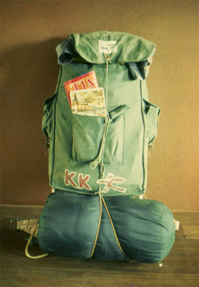
In the 1970s my possessions fit into this backpack and included a change of clothes, a toothbrush, mosquito netting and 300 rolls of film.
|
|

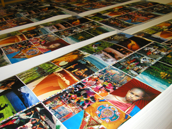
Piled up on the printing house floor are some of the stacks of 30,000 sheets for a signature of pages from the middle of the book.
|
|

(in order of their help) |
|
Pat and Joe Kelly |
- |
My parents, who never said "Why?" |
|
Bruce McElfresh |
- |
National Geographic Photo Editor who encouraged me |
|
Steve Hake |
- |
For getting me to Asia the first time
|
|
Brian Kelly |
- |
My brother and occasional traveling buddy
|
|
John Plunkett |
- |
Counsel on visual bookmaking
|
|
Al Graynor |
- |
Expertise in scanning
|
|
Paul Donald |
- |
The best design advice of all - no words!
|
|
Stephanie Johnson |
- |
Quark template and instruction
|
|
Warren Baskin |
- |
Workflow consulting
|
|
Michele McGinnis |
- |
Organizer
|
|
Charles Platt |
- |
Photoshop guru
|
|
Benedikt Taschen |
- |
For believing in the book, and me
|
|
Angelika Taschen |
- |
Cover designer
|
|
Pedro Lisboa |
- |
Production genius
|
|
James Home |
- |
Website creator
|
|
|
|